05-31-2014, 06:10 AM
(This post was last modified: 05-31-2014, 06:12 AM by puggsoy.)
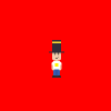
I felt like giving this a shot yesterday, since I want to get into spriting eventually anyway. I probably won't update very often for now, but hopefully I should start getting more serious about it once I manage to free up some time.
So here's my first ever custom sprite:

Crit is welcome of course, but since I'm not doing any particular style that might be difficult. Basically I'm just going for simplicity at the moment, I don't want to go into any expert techniques. But yeah, I'll try and apply any improvements you can suggest.
Oh and if anyone could suggest a better background colour that would be cool too, I'm having trouble picking one that fits well.
Posts: 2,914
Threads: 96
Joined: Dec 2009

For your first sprite, it's not bad. It's a little small, but it gets the job done.
If you really want to try something impressive, though, go for a little shading next!
(02-27-2014, 07:31 PM)Gors Wrote: DO NOT BE AFRAID TO SUCK. DO NOT BE AFRAID TO SHOW YOUR SUCKY ART. I think this needs to go noticed to everyone, because sucking is not failing. Sucking is part of the fun of learning and if you don't suck, then you won't own at pixelart
it's ok to suck, sucking is not bad, just try and aim to always do your best!
Posts: 353
Threads: 15
Joined: Dec 2012
05-31-2014, 06:38 AM
(This post was last modified: 05-31-2014, 06:39 AM by Paladin.)
I think some of the shapes seem square and there's not a lot of depth. His pose is weird too, it doesn't seem like he's relaxed at all. Legs also seem a bit short.
Like E-Man said, it's pretty good for your first sprite, but I also think you should try something more technically impressive after you're done with this.
Wanting or not, adding some detail is inevitable, as it's something really blocky right now. I mean, nothing wrong in that, however I can't really give c+c for that
For example, there's no definite anatomy; the legs aren't separated and the pose is stiff like a kokeshi doll or a matryoshka doll. And the colors are literally solid blocks of color. It is a step to spriting in general, but I think that adding a tiny bit more of detail will not hurt.
Keep it up!
Posts: 268
Threads: 19
Joined: May 2013


It sort of reminds me of Karoshi for some reason. For a first attempt, it looks good. Though like others have said, like it or not you do have to add details. The Jumpman sprites from Donkey Kong is a good example of detail in limited coloring. With three colors, you can tell his nose from his face, what clothing he's wearing, even seeing two legs.
05-31-2014, 07:54 PM
(This post was last modified: 05-31-2014, 07:55 PM by puggsoy.)
I decided to start anew and make him a big bigger in general, since I'm finding it a bit hard to modify something so small:

I made his legs longer and tried separating them, and had a go at shading his forhead below the hat brim. I can't really see where else shading would be appropriate, but feel free to have a go yourself if you want.
I'm not sure how to go about making him look relaxed, any details on what to change specifically? I tried to make it look like he's got his hands in his pockets but I'm not sure if it looks good.
I also feel like his eyes are a bit thin, but anything else looks too weird. Is this where anti-aliasing would be handy?
Posts: 174
Threads: 6
Joined: Jul 2013

puggsoy Wrote:Oh and if anyone could suggest a better background colour that would be cool too, I'm having trouble picking one that fits well.
usually i do some sort of very unsaturated green or blue, something bright is painful to look at
![[Image: 04ba2f3fca.png]](http://puu.sh/99Kup/04ba2f3fca.png)
see? it might just be me, but in my opinion i love working with colors like this
Thanks, that looks like a good colour. Choosing background colours for my own sprites seems a bit harder than those for ripped sprites (or it might have just been a while).
Anyway recme edited my sprite and gave me a couple of suggestions, so I tried to incorporate them myself:

He also suggested making the hat a bit shorter, but it's supposed to be quite tall. I did bring in the brim a bit though, I think that looks a bit better.
I also had a go at making him look more relaxed by bending his right arm a bit and letting his left leg lean out a bit. I had a bit of trouble with that so tell me if I'm still doing it wrong.
|


![[+] [+]](images/collapse_collapsed.png)
![[Image: sig.gif]](http://backloggery.com/fullbody/sig.gif)

![[Image: deT1vCJ.png]](http://i.imgur.com/deT1vCJ.png)
![[Image: okwksDc.png]](http://i.imgur.com/okwksDc.png)
![[Image: 04ba2f3fca.png]](http://puu.sh/99Kup/04ba2f3fca.png)
![[Image: summary-bbad004172a3ffceaf4a2064ce34344d.png]](https://ugc.masteroverwatch.com/images/signatures/summary-bbad004172a3ffceaf4a2064ce34344d.png)