![[Image: motherbrain.png]](http://img44.imageshack.us/img44/4681/motherbrain.png)
What I've been doing all day.
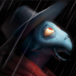
The plan; make the vat and the brain detailed, like a PA. It never moves, so it can be. The pink part with the face will have extra eyes and mouths for expressions. I also plan to do tentacles. If anyone wants to help me shade the brain, that'd be awesome.
![[Image: b1.php?u=39480955]](http://my.puregaming.org/banner/b1.php?u=39480955)
Quote:You had wasted MY LIFE... waiting for just a goddamn bunnelby model.
-The prestigious Farlavor
Posts: 4,662
Threads: 50
Joined: May 2008
Haha, creepy yet awesome!
Posts: 189
Threads: 5
Joined: Nov 2009
Her face is so accruate to her cartoon representation  :] On top fo that, there is some quite detailed lineart going on in the brain! it's hard to give any feedback!
Are the wires going to be added later, Ton?
Posts: 6,683
Threads: 49
Joined: Apr 2009


i have nothing to add except to be sure to catch the cartony and exagerated expresions, remember she moved her face around to make herself look more expresive
Quote:You had wasted MY LIFE... waiting for just a goddamn bunnelby model.
-The prestigious Farlavor
Posts: 133
Threads: 5
Joined: Aug 2008
I wouldn't mind helping a bit; I'm not awesome, but I think I'm pretty good. Just direct me where to go and the rules of the style.
If you don't really want the help shading, I can always just cheer you on/crit you.
It really does look awesome, good luck.
![[Image: Altered_photo1_sig.png]](http://i22.photobucket.com/albums/b330/maxdxam/Altered_photo1_sig.png)
My crit posts tend to make me look arrogant if read the wrong way. That is not my intention. I am open to discussing anything you disagree with, so please do.
Thanks man, sure, you can give it a go. The one that needs intensive shading is the one to the left of the "final" one. The style can be something like King Hippoe way over on the right. Don't be afraid to mess with the palette. I'll work on one too. 
Quote:You had wasted MY LIFE... waiting for just a goddamn bunnelby model.
-The prestigious Farlavor
Posts: 133
Threads: 5
Joined: Aug 2008
11-10-2009, 12:14 AM
(This post was last modified: 11-10-2009, 12:15 AM by Ego.)
Well, I'm stopping for now, homework to do, but I got through my spine.
![[Image: Motherbrain_captainN-1.png]](http://i22.photobucket.com/albums/b330/maxdxam/Motherbrain_captainN-1.png)
As is probably pretty evident, I kind of gave up on the style early on. I REALLY worked on getting some sort of illusion of depth though, and I'm actually pretty proud of it.
The second vertebrae down is a real bitch to get right, and it's the one piece I'm still not sure I like.
My crit posts tend to make me look arrogant if read the wrong way. That is not my intention. I am open to discussing anything you disagree with, so please do.
It's loads better than I could have done. And it looks like you got the shape of the "spine" right before I could even tell you. That's awesome, man! And I'm not too worried about the "style." It was just a suggestion.
Quote:You had wasted MY LIFE... waiting for just a goddamn bunnelby model.
-The prestigious Farlavor
Oh, and feel free to edit the lineart if you think the perspective needs work.
Quote:You had wasted MY LIFE... waiting for just a goddamn bunnelby model.
-The prestigious Farlavor
Posts: 1,293
Threads: 25
Joined: May 2008
Awesome!
I like creepy sprites
The bottom should be rounder however
Posts: 189
Threads: 5
Joined: Nov 2009
Mh, i'd try to show the 2 middle draining buttons (or whatever it's called) in a different angle, since they face more forward than the side wirebuttons.
Hmm, I'll work on both of those.
Quote:You had wasted MY LIFE... waiting for just a goddamn bunnelby model.
-The prestigious Farlavor
![[Image: mbface.png]](http://img211.imageshack.us/img211/3808/mbface.png)
I think I may have gone a bit too "Krang" with the colors.
EDIT: ![[Image: mbface.png]](http://img23.imageshack.us/img23/3808/mbface.png)
Which one looks the best?
Quote:You had wasted MY LIFE... waiting for just a goddamn bunnelby model.
-The prestigious Farlavor
Posts: 2,203
Threads: 49
Joined: Jan 2009
two is best
![[Image: OH4K4jX.gif]](http://i.imgur.com/OH4K4jX.gif) ![[Image: R7WBBzo.gif]](http://i.imgur.com/R7WBBzo.gif) ![[Image: TsJpssj.gif]](http://i.imgur.com/TsJpssj.gif)
----------------------- [Love]-----------------------
|


![[Image: 27348983yu7.png]](http://img535.imageshack.us/img535/8400/2hhfzud.jpg)

![[Image: motherbrain.png]](http://img32.imageshack.us/img32/4681/motherbrain.png)
![[Image: scaled.php?server=441&filename=ipposig.png&res=medium]](http://desmond.imageshack.us/Himg441/scaled.php?server=441&filename=ipposig.png&res=medium)
