Posts: 111
Threads: 6
Joined: Mar 2009
04-13-2009, 05:51 AM
(This post was last modified: 04-23-2009, 11:22 AM by WolfNM.)
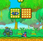
![[Image: MandL_Deku_Scrub_Sprites_by_WolfNM.png]](http://fc07.deviantart.com/fs45/f/2009/113/c/0/MandL_Deku_Scrub_Sprites_by_WolfNM.png)
Yeah I know the titles weird, but it's the only quote I can remember a Deku Scrub saying lol. This is a Mario and Luigi: Superstar Saga styled Deku Scrub for Black Boo's M&L Zelda project, not quite finished yet but not too far to go for overworld sprites.
C+C welcome
Click the banner metal fans
![[Image: Dark_Theory_Logo_by_WolfNM.png]](http://fc01.deviantart.com/fs39/f/2008/347/3/a/Dark_Theory_Logo_by_WolfNM.png)
Posts: 27
Threads: 1
Joined: Mar 2009
(04-13-2009, 05:51 AM)WolfNM Wrote: ![[Image: MandL_Deku_Scrub_Sprites_by_WolfNM.png]](http://fc05.deviantart.com/fs43/f/2009/103/1/7/MandL_Deku_Scrub_Sprites_by_WolfNM.png)
Yeah I know the titles weird, but it's the only quote I can remember a Deku Scrub saying lol. This is a Mario and Luigi: Superstar Saga styled Deku Scrub for Black Boo's M&L Zelda project, not quite finished yet but not too far to go for overworld sprites.
C+C welcome
Lol those are pretty darn cool. Can't see the eyes clearly though...
The pallet needs alot of work,
The walking animation looks stretched,
The leaves on his head seem strangely arranged
And the shading could use work.
i'm sure there are other problems too, but i dont know much about M&L Style.
Posts: 111
Threads: 6
Joined: Mar 2009
04-13-2009, 11:19 AM
(This post was last modified: 04-13-2009, 11:39 AM by WolfNM.)
@Dragon Knight: There eyes look like that anyway lol
@BigG: Well palletewise it's taken straight out of the M&L pallete, it's the same colours that Luigi uses. I know the walking animation isn't too great yet so I shall fix that soon, as for the leaves that's how they look in minish cap, which is what this is based off of and as for shading could you be more specific?
EDIT: Changed the first post a bit, I'm not sure it fixes the walking problem though
Click the banner metal fans
Posts: 258
Threads: 20
Joined: Feb 2009
business scrub not deku scrub
the feet in the walking poses look too small
try making them bigger
and in M&L walking the character bobs down every time the feet go the furthest in either direction
try and make that more noticeable
Posts: 111
Threads: 6
Joined: Mar 2009
04-17-2009, 04:26 AM
(This post was last modified: 04-17-2009, 05:08 AM by WolfNM.)
Minish Cap calls them plain Deku Scrubs, at least in that trophy thing you can get in it. I'll get to work on the walking sprites and then edit this post.
EDIT:
![[Image: MandL_Deku_Scrub_Sprites_by_WolfNM.png]](http://fc03.deviantart.com/fs44/f/2009/107/8/c/MandL_Deku_Scrub_Sprites_by_WolfNM.png)
Click the banner metal fans
Posts: 27
Threads: 1
Joined: Mar 2009
Pretty cool. A definate improvement.
Posts: 111
Threads: 6
Joined: Mar 2009
thanks, got another update with fixed shading on the back this time
![[Image: MandL_Deku_Scrub_Sprites_by_WolfNM.png]](http://fc02.deviantart.com/fs43/f/2009/108/1/4/MandL_Deku_Scrub_Sprites_by_WolfNM.png)
Click the banner metal fans
Posts: 130
Threads: 6
Joined: Feb 2009
04-18-2009, 02:55 PM
(This post was last modified: 04-18-2009, 02:58 PM by Mega_Virus.)
(04-13-2009, 10:51 AM)BigG Wrote: The pallet needs alot of work,
The walking animation looks stretched,
The leaves on his head seem strangely arranged
And the shading could use work.
i'm sure there are other problems too, but i dont know much about M&L Style.
I don't think there's really anything wrong with his sprite sheet except maybe the leaves on top of Deku's head but everything else looks fine to me. I havent try'd the animation out so I can't say anything about that but you said the body is too stretched, and I say not if he would make it any less stretch it would look fat unless he minimized the sprite, I read what you said about the leaves being disarranged so I try'd to fix it up here's what I did with it, I hope he doesn't mine, I'm not quite found of Deku anyways.
![[Image: 2aa3c56e18.png]](http://www.freeimagehosting.net/uploads/2aa3c56e18.png)
Posts: 111
Threads: 6
Joined: Mar 2009
that actually looks a hell of lot better, thanks lol

Also I've updated the sprite since he said that it looked stretched.
Click the banner metal fans
Posts: 111
Threads: 6
Joined: Mar 2009
bump due to update on the sprite (first post updated)
Click the banner metal fans
Posts: 111
Threads: 6
Joined: Mar 2009
another bump another update
Click the banner metal fans
Posts: 6,683
Threads: 49
Joined: Apr 2009


you should try to make those eyes a bit more readable. don't be afraid to exagerate a bit.
Posts: 111
Threads: 6
Joined: Mar 2009
![[Image: fuckingEYES.png]](http://i3.photobucket.com/albums/y73/No1nm/fuckingEYES.png)
I was thinking the one on the far right, but maybe the one next it is closer to the exaggeration you were talking about
Click the banner metal fans
Posts: 598
Threads: 18
Joined: Nov 2008
The one to the far rights good but one next to it is a little too much.


![[Image: Bleach_Hitsugaya_Sig_by_swimmerchick875.jpg]](http://fc19.deviantart.com/fs32/f/2008/221/7/b/Bleach_Hitsugaya_Sig_by_swimmerchick875.jpg)
![[Image: Spiderman_sig_by_DevilDante88.jpg]](http://fc07.deviantart.com/fs29/f/2008/073/7/4/Spiderman_sig_by_DevilDante88.jpg)


![[Image: RuAIooB.png]](http://i.imgur.com/RuAIooB.png)
