Posts: 1,293
Threads: 25
Joined: May 2008
12-22-2008, 06:53 PM
(This post was last modified: 02-14-2009, 12:40 AM by Solink.)
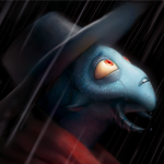
The Sheriff from Sheriff(XD)
In ssb project style
![[Image: shheerriiff-1.png]](http://i119.photobucket.com/albums/o156/A1exi_911/shheerriiff-1.png)
The small yellow thing is the official sprite
There are no artwork of this game so I had to redesign him
He's supposed to move like Mr. G&W
King Hippo from Punch-Out!!
In ssb project style
![[Image: khi.png]](http://i119.photobucket.com/albums/o156/A1exi_911/khi.png)
Remake of a Yoshi Cookie sprite I edited in 2006
![[Image: cm.png]](http://i119.photobucket.com/albums/o156/A1exi_911/cm.png)
Original rip by CrazyD
C+C please 
Posts: 262
Threads: 9
Joined: Jun 2008
King Hippo's pretty good he just looks a bit weird without the other arm.
I'll think of something to add later then.
Posts: 1,293
Threads: 25
Joined: May 2008
01-02-2009, 01:39 AM
(This post was last modified: 01-02-2009, 01:42 AM by Solink.)
Bump
(12-22-2008, 07:04 PM)Tero Wrote: King Hippo's pretty good he just looks a bit weird without the other arm. Well, we can't see it 'cause...he's...too fat =P
Glass Joe from Punch-Out!! if he was in Super Punch-Out!!
I found an old picture of Glass Joe, rotated it, made the lineart and shaded it.
So It's mostly custom
Oh, and in spo!!, there is no orange pallette so I had to make his hair brown
![[Image: cj-1.png]](http://i119.photobucket.com/albums/o156/A1exi_911/cj-1.png)
Posts: 480
Threads: 15
Joined: Jan 2009
i think hippo looks fine because of the lump showing his shoulder but i have some questions:
1) the top right sprite for sherrif, is that a moustache on him or what?
2) whats C+C stand for? at first i thought it was a program or the language with something added to it (C+calender, idk) but from the way you just used it i assume its comment and ___
Posts: 1,293
Threads: 25
Joined: May 2008
01-02-2009, 01:59 AM
(This post was last modified: 01-02-2009, 02:01 AM by Solink.)
(01-02-2009, 01:49 AM)Name_Changer Wrote: i think hippo looks fine because of the lump showing his shoulder but i have some questions:
1) the top right sprite for sherrif, is that a moustache on him or what?
2) whats C+C stand for? at first i thought it was a program or the language with something added to it (C+calender, idk) but from the way you just used it i assume its comment and ___ 1)He open his mouth
2)I'm pretty sure it's constructive criticism
EDIT: Welcome to TSRC! 
Posts: 232
Threads: 5
Joined: May 2008
(01-02-2009, 01:59 AM)Solink Wrote: (01-02-2009, 01:49 AM)Name_Changer Wrote: i think hippo looks fine because of the lump showing his shoulder but i have some questions:
1) the top right sprite for sherrif, is that a moustache on him or what?
2) whats C+C stand for? at first i thought it was a program or the language with something added to it (C+calender, idk) but from the way you just used it i assume its comment and ___ 1)He open his mouth
2)I'm pretty sure it's constructive criticism
EDIT: Welcome to TSRC!
Comments and Criticism.
Also, these sprites are looking good, but the shine on Glass Joe's glove looks banded.
Posts: 1,293
Threads: 25
Joined: May 2008
(01-02-2009, 02:07 AM)~BRICKLIN~ Wrote: (01-02-2009, 01:59 AM)Solink Wrote: (01-02-2009, 01:49 AM)Name_Changer Wrote: i think hippo looks fine because of the lump showing his shoulder but i have some questions:
1) the top right sprite for sherrif, is that a moustache on him or what?
2) whats C+C stand for? at first i thought it was a program or the language with something added to it (C+calender, idk) but from the way you just used it i assume its comment and ___ 1)He open his mouth
2)I'm pretty sure it's constructive criticism
EDIT: Welcome to TSRC!
Comments and Criticism.
Also, these sprites are looking good, but the shine on Glass Joe's glove looks banded. ![[Image: cj-2.png]](http://i119.photobucket.com/albums/o156/A1exi_911/cj-2.png)
?
Posts: 3,787
Threads: 75
Joined: May 2008


When he opens his mouth (sheriff), his lower jaw should go down.
Posts: 232
Threads: 5
Joined: May 2008
(01-02-2009, 01:10 PM)Solink Wrote:
?
Not what I was going at, but now that I look at it it's fine.
Posts: 1,293
Threads: 25
Joined: May 2008
Another punch-out!! sprite!
this time, I did a revamp of king hippo =D
![[Image: khipp.png]](http://i119.photobucket.com/albums/o156/A1exi_911/khipp.png)
Posts: 3,612
Threads: 81
Joined: Jan 2009
He still looks pretty flat (waist upwards), the shading's not very good on the shoes, his black eye-thing is far too dark compared to the other colours, the colour palette is a bit bland and could use a bit more saturation and contrast.
The shorts are fine, however, maybe they could take in count his belly (shadow casting, you see).
![[Image: x1aIZ2e.gif]](http://i.imgur.com/x1aIZ2e.gif) YOU HAVE TO FEEL WHAT YOU DRAW, FEEL
YOU HAVE TO FEEL WHAT YOU DRAW, FEEL
![[Image: shrine.gif]](https://dl.dropboxusercontent.com/u/344477/shrine.gif)
Posts: 1,293
Threads: 25
Joined: May 2008
![[Image: p-out_khippo.png]](http://i119.photobucket.com/albums/o156/A1exi_911/p-out_khippo.png)
fixed king hippo and made a small mockup
Posts: 602
Threads: 4
Joined: May 2008


")
King Hippo looks like he stole one of Robin's masks. You should fix his eyes and eyebrows.
Posts: 1,362
Threads: 10
Joined: May 2008
I love the sheriff 
Posts: 529
Threads: 13
Joined: May 2008
The Glass Joe is fantastic! But, King Hippo should have some sort of difference made between the eyes and the black in between them.
|


![[Image: scaled.php?server=441&filename=ipposig.png&res=medium]](http://desmond.imageshack.us/Himg441/scaled.php?server=441&filename=ipposig.png&res=medium)


![[Image: ioncesawyouholleringint.jpg]](http://img696.imageshack.us/img696/562/ioncesawyouholleringint.jpg)