Posts: 372
Threads: 16
Joined: Apr 2009


")
12-07-2010, 12:39 AM
(This post was last modified: 12-07-2010, 01:02 AM by Sketchasaurus.)
I thought that I might as well post some of my Custom sprites here for a little constructive criticism.
Here is a Pirate character that I had drawn a few years ago and have just recently decided to make a sprite of:
![[Image: capngingie.gif]](http://img809.imageshack.us/img809/659/capngingie.gif)
Here are some 8-bit dinosaur sprites.
![[Image: dinos.png]](http://img843.imageshack.us/img843/5904/dinos.png)
and here is a Tyrannosaurus rex Sprite. based off of the "Sprite style" of the Pokémon Fire Red games, although it uses more "dithering" than most of the sprites in the game.
![[Image: rexpkmndking.png]](http://img835.imageshack.us/img835/8531/rexpkmndking.png)
Posts: 314
Threads: 4
Joined: May 2009


Oh hei I know you from DA, nice sprites btw.
Posts: 185
Threads: 9
Joined: Apr 2009
Your 8-bit dinosaurs actually genuinly inspire me, I'd play an EVO-like game with those, very cute.
Posts: 6,055
Threads: 111
Joined: May 2008
Dinosaur lover eh? You got great promise, keep things up.
Posts: 372
Threads: 16
Joined: Apr 2009
Thanks for the encouragement guys. 
I felt like making more Pokémon styled Dinosaurs and made this Spinosaurus today.
![[Image: spino.gif]](http://img31.imageshack.us/img31/2162/spino.gif)
It's not 100% complete, but I'm putting it here to see if there's anything I can do to improve it.
Posts: 2,507
Threads: 30
Joined: May 2009
The blue eyes are very unnecessary and plain, dry re-using the other colors already provided.
Posts: 372
Threads: 16
Joined: Apr 2009
Changed the colour of the eye and fixed the leg.
![[Image: spino2.gif]](http://img600.imageshack.us/img600/7404/spino2.gif)
Posts: 1,502
Threads: 7
Joined: Oct 2008
The way its left (our right) arm is splayed out sideways looks a bit awkward to me. I'd reduce the angle so that it's pointing more towards the viewer rather than off to the side.
If we were viewing him straight on, rather than in 3/4 view, his arm would actually be reaching slightly behind him as you've drawn it now :v
Posts: 1,774
Threads: 40
Joined: May 2008
Dinosaurs are rad as fuck, and these are pretty cool too
Posts: 372
Threads: 16
Joined: Apr 2009
12-07-2010, 06:52 PM
(This post was last modified: 12-07-2010, 06:56 PM by Sketchasaurus.)
![[Image: spinosaru.png]](http://img52.imageshack.us/img52/7143/spinosaru.png)
Fixed the arm. Thanks for the input
EDIT:
![[Image: spinosaru.png]](http://img35.imageshack.us/img35/7143/spinosaru.png)
I fixed a little shading error on the arm and made a few minute edits.
Posts: 178
Threads: 8
Joined: Jan 2010
Nice work. Definitely reminds me of pokemon when I look at that.
Posts: 185
Threads: 9
Joined: Apr 2009
Make a sprite comic about dinosaurs, call it "dinosaur comi-" oh wait.
Call it "Comic dinosaurs".
Sprites? And dinosaurs? In the same topic?
i might have to close the topic due to the gg, extreme amount of sheer awesome in one topic. Sorry Mr. Saurus ):
just kidding, these are really awesome.
And you totally have to make Comic Dinosaurs. :V
however i'd call it MOSTLY BIPEDAL PREHISTORIC LIZARDS IN A PIXELATED SOCIAL COMMENTARY
Posts: 372
Threads: 16
Joined: Apr 2009
I've been thinking about making a Dinosaur comic called "Out of Time" but it'd be a drawn comic.
In other Dinosaur-related-news, I started making a Saichania sprite in the same style as my Spino. It still needs a lot of work (because it still doesn't have all of its spikes and whatnot)
![[Image: saichania.png]](http://img258.imageshack.us/img258/4968/saichania.png)
The T. rex, Spinosaurus, and this Saichania's colour patterns are based off of those from the Dinosaur King Arcade game.
Posts: 1,502
Threads: 7
Joined: Oct 2008
12-08-2010, 04:39 PM
(This post was last modified: 12-08-2010, 04:41 PM by Chutzpar.)
His left (our right) leg should have more shadow on it, I think. Judging by how you've shaded the rest of the sprite, the lightsource is at the top-left, but the shading on the left leg suggests there's light hitting it from the right. There should be some shadow obscuring it from its "shell", so most of it should at least be using your middle value, I think.
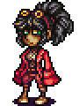
Also, I don't know if you're still working on this:
but there's a couple general pointers I wanted to bring up.
Firstly, it might just be because my monitor's pretty dark, but there doesn't seem to be enough contrast on his jacket and boots; I really had to squint to make out the shading!
Secondly: unless I'm very much mistaken, it looks like you're using completely desaturated colours for your blacks and the white piping on his jacket. Don't do that. It completely kills any sort of unity your colour-scheme has; give it the teeniest red tint and it'll pull the whole sprite together more and make it seem less flat.
You could give it a slightly blue tint if you want it to contrast with your oranges, but because there's just so much black, it strikes me that going for a analogous colourscheme would be the better option. If in doubt, try both :V
|


![[Image: THENEWSIGNATURE.png]](http://s13.postimg.org/50qifokt3/THENEWSIGNATURE.png)
![[Image: hero_oh_hero_banner_by_neoriceisgood-d5tjv2c.png]](http://fc05.deviantart.net/fs71/f/2013/033/c/3/hero_oh_hero_banner_by_neoriceisgood-d5tjv2c.png)
![[Image: mousey.gif]](https://gifsound.com/?gif=i.imgur.com/TcCcmRE.gif&v=-9QFAQ4Am7M)
![[Image: 6WzBw.gif]](http://i.imgur.com/6WzBw.gif)


![[Image: 57d2BGH.png]](http://i.imgur.com/57d2BGH.png)