


11-18-2010, 12:33 AM
(This post was last modified: 11-22-2010, 01:00 AM by X Gamer 66.)
Users browsing this thread: 1 Guest(s)
|
Amitie
|
|
Posts: 1,222
Threads: 26 Joined: Aug 2008 
")
11-18-2010, 02:32 AM
Looks really sweet, but I have to say her left elbow (I'll refer to the bent arm as the left one) seems a little bulbous, and her left fingers are too stubby in comparison to the other hand.
Thanked by: X Gamer 66
I really like it, although I think her legs could be thinner (they should be slightly thicker than the arms)
I would shrink the raised hand by a lot, since it looks bigger than the other hand (even though perspective says otherwise) also, the face needs some work she has no chin right now. Even though she's a little girl, she must have a somewhat pointy chin. I'd put the center of the "v" shaped chin right under the nose (if anything, I'd redo the entire chin area to look pointier) I'd redo the left eye. not only does it look lazy, it creates a tangent along the left side of the face, which looks severely flat thanks to the mistake. I'd add more pixels to the head's left side (to give more room to drawing the left eye correctly) to fix it worst of all, the eyes are off-perspective right now. The eyes need to follow the head and the hat's perspective.. take a close look at these two pics ![[Image: derp2j.png]](http://img217.imageshack.us/img217/6117/derp2j.png) ![[Image: derp1.png]](http://img821.imageshack.us/img821/5300/derp1.png) you should probably see how the eyes are off by now Thanked by: X Gamer 66
Posts: 9,905
Threads: 264 Joined: Jun 2008 


11-18-2010, 08:58 AM
the wings also don't match the perspective. If they're placed on the cap's side, the right wing (our left) shouldn't point that way.
that, and make the lines smoother. Avoid breaking out the outlines that much too. Thanked by: X Gamer 66
11-19-2010, 09:56 PM
Thanks for crits!
gragh I wish I could understand how to draw hands ![[Image: amiprev2.png]](http://img834.imageshack.us/img834/9787/amiprev2.png) Hows this? anything new i should fix?
Posts: 2,335
Threads: 42 Joined: May 2008

11-19-2010, 10:34 PM
I think it all looks a bit better now, especially her right hand.
Thanked by: X Gamer 66
11-20-2010, 08:30 AM
i'm sorry if i don't feel like typing, i hope you notice everything i've changed and that it helps!
![[Image: xgamered.png]](http://img84.imageshack.us/img84/7356/xgamered.png)
Thanked by: X Gamer 66
Posts: 185
Threads: 3 Joined: Sep 2010
11-20-2010, 04:36 PM
The eyes of this sprite are off-putting.. I think they're slightly misplaced. I tried to do something else with them; maybe more along the lines of these?
![[Image: 2r5bzir.png]](http://i55.tinypic.com/2r5bzir.png)
Thanked by: X Gamer 66, Chris2Balls [:B]
11-22-2010, 12:58 AM
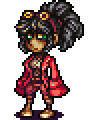
![[Image: amiprev3.png]](http://img200.imageshack.us/img200/7326/amiprev3.png) Looking any better? Something still seems odd, but I have no idea what.
11-22-2010, 04:37 AM
Just a few general points that I notice at a first glance;
1# Her legs aren't sexy at all, they remind me of skinny man legs, is this intentional? 2# The general lightsource is very ambiguous, you could probably make it look better if you had a more ... intentional-looking set of shadows. 3# Her face reminds me a bit of a round blobby toad, it has a much more defined shape in the source material. 4# Her general bodyshape (the shirt part) is a lot blobbier and less defined than the source material as well. ------------------- Things I like so far; 1# I think the arm that's pointing (shoulder to bracelet) looks pretty darn spot on, like the shaping, shading and everything; I don't think you should really change it at all anymore. ----------------------- Otherwise I'd like to ask, what are you trying to do with this piece? emulate the original style? do your own thing? Right now it has a bit of a "generic fanart" feel to it, where you took the character, mildly copied it, half true to the source material half just seeing what it'll end up being, advice on what to do with it might vary depending on what your real intention for this piece is; Did you do it to honour the character? To practice, to do something new? explicitly thinking about purpose might help set a general direction. Otherwise the piece is all fine and dandy, but I do feel it can be improved a lot. Thanked by: X Gamer 66
11-22-2010, 05:06 PM
it's a girl?
ahhh well excuse the knobbly knees in my edit then welp
11-22-2010, 06:52 PM
Well I never really thought about it "why" I'm doing it. I've been playing Puyo Pop recently and just made the sprite for fun. But I suppose art does need a direction, maybe that's why I'm having trouble making it stand out. in that sense, I guess it technically is generic fan art, heh.
I might see what I can do later. Thanks a ton for the tips, Neorice. |
|
« Next Oldest | Next Newest »
|
![[Image: untitledre6.gif]](http://img260.imageshack.us/img260/5720/untitledre6.gif)
![[Image: lZfN51N.png]](http://i.imgur.com/lZfN51N.png)


![[Image: deT1vCJ.png]](http://i.imgur.com/deT1vCJ.png)

![[Image: x1aIZ2e.gif]](http://i.imgur.com/x1aIZ2e.gif)
![[Image: shrine.gif]](https://dl.dropboxusercontent.com/u/344477/shrine.gif)
![[Image: hero_oh_hero_banner_by_neoriceisgood-d5tjv2c.png]](http://fc05.deviantart.net/fs71/f/2013/033/c/3/hero_oh_hero_banner_by_neoriceisgood-d5tjv2c.png)