

12-23-2009, 08:28 PM
![[Image: giratina1.png]](http://img85.imageshack.us/img85/4921/giratina1.png)
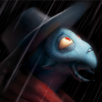
You are such a pain in the ass to sprite.
Also why don't you like me? I am being nice to you. :<
(WIP in case you weren't aware.)
|
Oh Giratina.
|
|
12-23-2009, 08:28 PM
You are such a pain in the ass to sprite. Also why don't you like me? I am being nice to you. :< (WIP in case you weren't aware.)
Posts: 9,905
Threads: 264 Joined: Jun 2008 


")

12-23-2009, 08:49 PM
I don't like him. Not your fault though, he's got so many things attached on him he's a pain to draw/pixel/etc.
You're doing a good jog on it, though. *clicks egg in your sig*
Wings look illogical.
Expand them with a final "finger" pointing as far distaly as you can.
12-24-2009, 01:23 AM
Well, I was referencing some official art where the wings pretty much look like that, but when I get around to finishing this I'll mess with the wings a bit.
12-24-2009, 08:02 AM
Yeah, most Pokémon don't have what you'd call 'functioning' wings.
Salamence is a good example. You're doing a good job, though!
12-24-2009, 08:58 AM
A better example of unfunctional wings would be:
http://archives.bulbagarden.net/media/up...gonite.png I always wonder how something that big could fly with wings like that.
12-24-2009, 09:07 AM
What about Dunsparce? I mean really...
Getting back on topic, palette seems kinda off contrast.
12-24-2009, 03:46 PM
Not sure exactly what you mean by off-contrast. Mind explaining a bit more?
12-25-2009, 09:38 PM
Like, when you go to a photo-editing site, you can change the contrast, and the colors get more...popping? It's hard to explain. :/ Sorry. Can't really get the words out.
12-26-2009, 01:12 AM
Well, that IS called contrast, but this certainly doesn't need more of that.
I think that if you mean the yellow parts need to pop more from the rest of it, the best solution is to darken the grays a little, and to darken the reds down the neck. Because you share the red between the neck stripes and the yellow parts it makes the red to pop too much. As it is, it looks like the red is an energy beam between the yellow things. Okay, what I just typed is true, but I found another thing that I think fixes it even better. You see those little bright spots between the yellow things? You know, the ones to the left and right of the red spots? Fill them in. Having it bright gives the impression that there is no shadow being cast by the yellow things, scrapping the "pop" factor of the depth. I know it's gray on the official art, but with such a narrow sprite, you should just scrap it. Also, Jesus Lizard is partially correct. You need a fourth wingtip, but not to make it look functional. If you look at the official art you gave us, there is a wingtip behind each of the three red spikes things and then a fourth one that is furthest out. However, I understand that it may be best kept as 3 because of size proportions. Your call. In general though, great job so far. You have amazing control of my own weakest technique(lineart). |
|
« Next Oldest | Next Newest »
|


![[Image: deT1vCJ.png]](http://i.imgur.com/deT1vCJ.png)
![[Image: scaled.php?server=441&filename=ipposig.png&res=medium]](http://desmond.imageshack.us/Himg441/scaled.php?server=441&filename=ipposig.png&res=medium)
![[Image: garrybeusymonsters.gif]](http://img585.imageshack.us/img585/3126/garrybeusymonsters.gif)
![[Image: 10y3mgj.png]](http://i44.tinypic.com/10y3mgj.png)
![[Image: groove-1.gif]](http://i119.photobucket.com/albums/o156/A1exi_911/groove-1.gif)

![[Image: Altered_photo1_sig.png]](http://i22.photobucket.com/albums/b330/maxdxam/Altered_photo1_sig.png)